
In 2015 businesses simply cannot ignore that their users are viewing their web site on mobile devices. Responsive web design has emerged as the de facto trend as it allows sites to adapt to smaller screens.
This makes the need for responsive design critical, as it adapts your web site design to both the size and connection speed of smaller devices.
 A few handy tips can greatly improve the performance of you responsive web site.
Mobile First
A mobile first strategy involve designing the mobile site first and then scaling up for tablets and desktop computers. If your web site looks good and is easy to read on a mobile device it won’t be hard to read on a desktop. Starting with mobile allows you to work down your site to its essentials elements. This allows you to streamline and focus your message. Once you have locked down a design that excels on the small display of a mobile device it can easily be expanded to fit larger areas.
Navigation
Navigation is one of the most critical elements of a responsive web site. Success and failure often depends on the user experience created by the sites’ navigation. Users no longer will stumble around web sites trying to find what they are looking for. In this day and age users expect interfaces to be intuitive and easy to use. Good sites typically have self explanatory navigation.
Simplify
Desktop sites for the longest time favored complicated visual designs with massive amounts of content and many navigation options. These days streamlined, clean designs with plenty of white space are recommended for responsive sites. Not only to customers tend to appreciate the speed with which these simplified designs load but they the minimal design tends to give sites a modern look that sets them apart from older designs. It is important that sites load quickly on mobile devices and simplifying design is one of the best ways to do this.
Responsive web sites should display a consistent look and feel across mobile, laptops and desktop computers.
You can no longer ignore responsive design. It is necessary for any business.
Photo: Serge Kij (Flikr) http://bit.ly/1JStB7F
Smartphone use has become an important part of our modern lives and has become “the way we do things”. According to a recent study by GlobalWebIndex, 80% of all online adults now own a smartphone. Additionally their research discovered that “75% percent of smartphone users are accessing mobile internet services on their smartphones.”
Clearly if your business isn’t presenting a mobile friendly face right now it is missing out on a sizable opportunity to interact with your target consumers and increase sales. Mobile isn’t something you need to think about in the future, mobile is right now.
 Moving forward, how do you get the most of your mobile web site and or mobile applications?
1. Start with Strategy
Start with an understanding of your objectives. Any good strategy begins with objectives, but be careful not to only consider your business’s objectives. Any good mobile strategy will be sure to consider who the end users are and what their objectives are going to be as well. In fact, placing a priority on a customer based focus will pay dividends.
You will also want to analyze technical issues as well such as whether you should hire in house talent or look for a mobile application developer to help you with your project. Other technical considerations such as choice of platform should be part of your strategy as well. Are you going to be building mobile applications or a mobile web site? Or both? Your choice can depend on your business and the goals of its mobile program.
If you are looking to deliver data such as locations or reviews to help customers and potential customers while they are on the go, then mobile web sites are a terrific way to deliver that information due to the proliferation of mobile searches. On the other hand, if you want to stay connected to loyal customers and increase engagement with them, then mobile apps are definitely the way to go. Ideally modern businesses would make make both options available.
2. UX is a Priority
Regardless of which strategic choices you make above you will want to make sure you prioritize user experiences as part of your project. Your mobile web site and mobile application will need to provide information to users in a clean, easy to understand format. The smaller size of mobile devices, along with the fact that they are often used on the go, make ease of use a priority that cannot be ignored. You must make information easy to access and easy to consume.
3. Personalize the Experience
Never before have marketers and businesses had access to provide personalized experiences they way they can with mobile. Mobile devices allow consumers to access information instantly creating a great deal of change in consumer expectations towards retailers. Today’s consumers want to be able to choose whether or not they receive notifications and if they opt-in, require that a business is delivering relevant personalized content. One-size-fits-all is not how consumers think and businesses should not try to paint them into that box with their mobile offerings.
4. Alerts and Notifications
Modern consumers are regularly checking their mobile devices (often whether they get an alert or not). We have become somewhat tethered to our devices. Since people are regularly checking their mobile devices, it would be silly not to send out alerts and notifications to increase engagement with your mobile application or business. But please be careful that you do not annoy your customers by sending out too many notifications, sending out notifications about trivial items that will make customers feel like you are wasting their time or sending out notifications at inappropriate times. You will also want to make sure you provide an easy way to opt out or refine the delivery to personal tastes.
5. Leverage Location
By using geo-location, you can generate location-based ads, alerts and notifications that can send out targeted messages to specific customers. Beyond personalizing a user’s experience and content you can also make it contextually relevant by delivering it based on location as well. It is estimated that fewer than one quarter of the offline businesses are making effective use of location based marketing so there is ample opportunity to gain advantage over your slower to adopt competitors.
Photo: Marco (Flikr) http://bit.ly/1I4MstH
Search is going mobile in a big way, not due to the changes in Google’s algorithm that took effect yesterday, but because that is the device people are actually choosing to make searches from.
 Fact is that most of the local searches, 60 percent, now take place from a smartphone or tablet. (Local Search Association)
Google’s change in their algorithm is a response to how people actually search in an effort to improve results. Yesterday they updated their algorithm to include data on whether a site is mobile-friendly or not. This means that the search results from mobile devices will include whether a site is mobile friendly or not in determining their rankings. Google is responding to changes in consumer behavior to improve their product.
Businesses that are prepared with mobile friendly web sites will benefit and those that are not will lose ground.
Regardless of the changes Google made yesterday, businesses that are not prepared are most likely already feeling the negative effects of not having mobile friendly offerings for their business. Consumers find web sites built for desktop viewing as clunky and unfriendly on mobile devices and are quick to abandon them. Additionally, sites built for desktop viewing are rarely optimized to load fast and often users well bounce before the site even loads.
Consumers’ expectations and habits are changing and businesses must keep up. The trends are clear, not only is search from mobile devices growing rapidly but according to the Local Search Association, only 40 percent of adults in the US now use PCs to search for products or service locally, which is a 9% decline from 2014. On the other hand, 90 percent of all users said they have used mobile devices while in stores, additionally, 52 percent have used smartphones to perform searches while in an automobile.
Furthermore, this same study also indicated that 54 percent of users have used their smartphone to look for specials while in a store and 51 percent have used it to compare prices.
It isn’t just about getting found on the search engines, people feel more favorably towards your brand when you offer satisfying experiences and this applies to your mobile web site as well. When your mobile web site offers an optimized user experience it builds trust and improves engagement.
Unfortunately, if your mobile web site is difficult to use customers are likely to head to your competition rather than taking the time to go sit down at a desk top computer to use your web site. If you can’t provide your customers want, you will lose the opportunity for a sale and even more importantly, risk losing customers permanently.
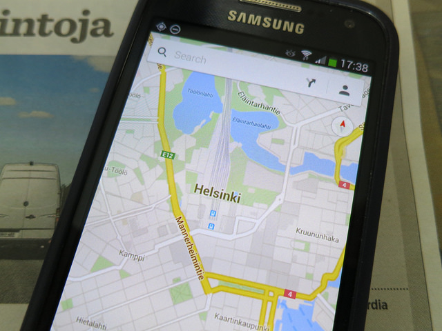
Photo: Matti Mattila (Flikr) http://bit.ly/1QfhP8j